An overview is one or two sentences that sum up the main features of a Task 1 visual in general words: what rose, what fell, what was biggest, what changed. It focuses on the big picture rather than detailed figures, adds no reasons, and usually comes straight after the introduction.
It matters because the marking criteria name it. For Academic Task 1, Task Achievement at band 7 asks for "a clear overview", and band 6 for an overview that is "attempted". Below you'll see what counts as an overview and what doesn't, one example for each of the 7 kinds of visual, and a chart to practise on before you see our answer.
What the band descriptors say about the overview
Your Task 1 answer gets four scores of equal weight: Task Achievement, Coherence and Cohesion, Lexical Resource, and Grammatical Range and Accuracy. The overview is part of Task Achievement. This is the wording of the official Writing band descriptors for Academic Task 1:
| Band | Official wording (Task Achievement) | What it means for you |
|---|---|---|
| 7 | "It presents a clear overview, the data are appropriately categorised, and main trends or differences are identified." | A clear overview that names the main trends or differences |
| 6 | "A relevant overview is attempted." | An overview is there and on topic, even if it is not fully clear |
| 5 | "There may be a tendency to focus on details (without referring to the bigger picture)." | Details with no big picture: the overview is missing or lost |
The same document says: "A script must fully fit the positive features of the descriptor at a particular level." So an answer with no overview at all does not fully fit the band 6 description of Task Achievement. The overview is not the whole score, though. Band 7 also asks for key features that are "covered and clearly highlighted", and the other three criteria count just as much.
Some guides still quote older wording, such as "no clear overview" at band 5. The PDF on ielts.org, updated May 2023, is the current version. IELTS also uses the word more broadly: the Academic Writing format page says Task 1 "tests if you can give a well-organised overview of the visual information". In this guide, overview means the summary sentences inside your report.
How often first answers lack overview wording
We checked each learner's first scored answer on each Task 1 type on GoPrep for overview wording: overall, in general, it is clear, it can be seen, in summary and similar phrases. About 1 in 5 first answers (712 of 3,688) had none. Pie charts lacked it most often, tables least often:
| Task 1 type (first answers) | No overview wording | Average first band |
|---|---|---|
| Pie chart (1,071) | 28% | 5.5 |
| Process (471) | 20% | 6.0 |
| Line graph (762) | 19% | 5.5 |
| Mixed charts (484) | 16% | 6.0 |
| Map (317) | 12% | 6.0 |
| Bar chart (364) | 11% | 6.0 |
| Table (219) | 8% | 6.0 |
Our guides to each chart type count each student's first answer inside this period instead, without checking earlier attempts. Their groups are larger and their shares differ by up to 2 points; the rounded average bands are the same.
The lower the band, the more often the overview wording was missing:
| Band of the first answer | Answers | No overview wording |
|---|---|---|
| 4.5 or lower | 713 | 45% |
| 5.0 to 5.5 | 1,357 | 21% |
| 6.0 to 6.5 | 949 | 8% |
| 7.0 or higher | 669 | 4% |
Across all 3,688 first answers, those with overview wording averaged 6.0 and those without it 4.5. Answers without it were also shorter, but the gap stayed among answers of 150 words or more: 6.5 against 5.0 (2,548 answers).
The same learners tell a more modest story. 157 learners wrote first answers of both kinds, on different chart types. Across all 157, answers with overview wording averaged 5.5 and answers without it 5.0. For 90 of them, the average of their answers with the wording was higher than the average of their answers without it. So much of the big gap reflects who wrote each kind of answer. This is a correlation: it can't show that one added sentence raises a score by itself.
A marker phrase is not the same as an overview. The GoPrep AI examiner also gives each Task 1 answer a separate overview sub-score (1 to 9) within Task Achievement, so we compared the two:
| Marker phrase in the answer | Overview sub-score 6 or higher | Overview sub-score 4 or lower |
|---|---|---|
| Found (2,976) | 71% | 6% |
| Not found (712) | 25% | 39% |
So 1 in 4 answers without the phrases still had a reasonable overview, and a few answers with Overall had a weak one. The phrases were missing most often in lower-scoring answers, but the word check alone can't tell whether an overview was absent or just unsignalled. What counts is the content of the sentence, which the rest of this guide is about.
What an overview is, and what it isn't
Take a simple line graph of daily trips in one city. Here is the data behind it:
| Year | Cycling trips a day | Car trips a day |
|---|---|---|
| 2005 | 20,000 | 180,000 |
| 2015 | 55,000 | 170,000 |
| 2025 | 95,000 | 140,000 |
Five sentences a candidate might write. Only one is a real overview:
| Sentence | Overview? | Why |
|---|---|---|
| The graph shows how many trips were made by bicycle and by car in one city between 2005 and 2025. | No: introduction | It repeats the task and names no feature |
| Cycling trips rose from 20,000 to 95,000 a day. | No: body detail | One line, with exact figures |
| Overall, the city became greener because people care more about the environment. | No: a reason | The graph shows no causes or opinions |
| In conclusion, both types of transport changed. | Weak | Too vague: which way, and how do they compare? |
| Overall, cycling trips rose sharply while car trips declined, although travelling by car remained more common. | Yes | Two main features in general words, no detailed figures |
Where to put the overview
A reliable Task 1 report has four paragraphs:
- Introduction. One sentence that paraphrases the task (says it in your own words).
- Overview. One or two sentences on the main features.
- Body paragraph 1. The first group of details, with figures.
- Body paragraph 2. The remaining details, with figures and comparisons.
The overview can also go at the end as a summary. IDP's advice is to make it your second sentence, so it is already there if you run out of time. Aim to spend about 20 minutes and write at least 150 words on the whole report, so an overview of about 20 to 40 words, a common guide rather than a rule, fits easily.
How to write an overview in 2 minutes
- Look at the chart as if you had 2 seconds. What would you remember? That is your first feature.
- Find a second feature: a contrast, a new leader, an exception, or something that stayed the same. Two main features are usually enough for one or two sentences.
- Write it with Overall, and general words: rose, the largest, most, the only one that fell. Keep detailed figures for the body. A year that marks a change or the number of stages in a process can help.
- Check three things: no list of values, no reasons, and it doesn't repeat your introduction.
Steps 2 and 3 are advice from teaching practice, not IELTS rules: the descriptors ask for a clear overview with main trends or differences, and they don't set a length or a number of features.
These patterns cover most overviews:
| What you noticed | Pattern | Often fits |
|---|---|---|
| Two opposite trends | X rose, while Y fell. | Line graph, bar chart |
| A clear leader | X was the largest throughout the period. | Bar chart, table, pie chart |
| A new leader | X replaced Y as the main... / X overtook Y. | Line graph, pie chart |
| One exception | Z was the only one that fell. | Table, bar chart |
| A map | The area became more residential, while... stayed the same. | Map |
| A process | The process has N stages, beginning with... and ending with... | Process diagram |
| A projection on the chart | X is expected to overtake Y. | Line graph or bar chart with future years |
For more words to describe trends and proportions, see Task 1 vocabulary.
One overview for each chart type
First ask whether the visual shows change over time (years, months) or one moment. Over time, look for trends: up, down, peaks, crossings. At one moment, look for rankings and differences: the largest, the smallest, the biggest gaps. Then the question changes with the visual:
| Chart type | Usually shows | Ask yourself |
|---|---|---|
| Line graph | Change over time | Which lines rose, fell or crossed? |
| Bar chart | One moment, or change over time | Which bars are highest and lowest? Do the groups follow one pattern? |
| Pie chart | Shares at one moment, or at two | Which slice is biggest? Which changed most? |
| Table | One moment, or change over time | Which row stands out: highest, fastest growth, the only fall? |
| Map | Change between two dates | What did the place become, and what stayed? |
| Process | Stages, not a trend | How many stages? Where does it start and end? |
| Mixed charts | Depends on each chart | What is the main point of each chart? |
The data below is invented for practice. Each overview is written by the GoPrep team.
Line graph
The cycling data above:
Overall, cycling trips rose sharply over the twenty years while car trips declined, although travelling by car remained more common.
Two features: opposite trends, and the gap that remained. More in the line graph guide.
Bar chart
| Age group | Print (hours a week) | Screen (hours a week) |
|---|---|---|
| 16 to 24 | 1.5 | 6.0 |
| 25 to 44 | 2.0 | 4.5 |
| 45 to 64 | 3.0 | 2.5 |
| 65 and over | 4.5 | 1.0 |
Overall, screen reading fell with age while print reading rose, so the youngest group read mostly on screens and the oldest mostly on paper.
Two features: the two opposite patterns, and the switch between the youngest and oldest groups. More in the bar chart guide.
Pie chart
| Spending | 1990 | 2020 |
|---|---|---|
| Food | 35% | 20% |
| Housing | 25% | 34% |
| Transport | 12% | 15% |
| Leisure | 8% | 14% |
| Other | 20% | 17% |
Overall, housing replaced food as the largest share of spending, and the share spent on leisure grew noticeably.
Two features: a new leader, and the fastest-growing slice. With two pies, compare them; don't describe each one separately. More in the pie chart guide.
Table
| University | 2015 | 2025 |
|---|---|---|
| Northfield | 4,200 | 6,800 |
| Eastbridge | 3,900 | 3,100 |
| Kingsley | 1,200 | 2,900 |
| Harwood | 2,500 | 2,600 |
Overall, Northfield had the most international students in both years and saw the largest increase, whereas Eastbridge was the only university where numbers fell.
Two features: the leader, and the one exception. A table has no picture to help you, so scan each row for its direction first. More in the table guide.
Map
| Area of Ashby | 2000 | 2025 |
|---|---|---|
| North | Farmland | Housing estate |
| Centre | Shops and a post office | Shops; the post office is now a café |
| East | Forest | Forest (unchanged) |
| South | Narrow road | Wider road and a new railway station |
Overall, Ashby became more residential and gained better transport links, while the forest in the east was left untouched.
Two features: what the village turned into, and what survived. Single buildings like the café belong in the body. More in the map guide.
Process diagram
| Step | Stage | What happens |
|---|---|---|
| 1 | Collection | Used paper is collected |
| 2 | Sorting | Paper is sorted by type |
| 3 | Pulping | It is mixed with water to make pulp |
| 4 | Cleaning | Ink and glue are removed |
| 5 | Pressing and drying | The pulp is pressed into sheets and dried |
| 6 | Delivery | New paper rolls are sent to printers |
Overall, the process has six stages, beginning with the collection of used paper and ending with the delivery of new rolls. The main change happens in the middle, when old paper is turned into pulp and pressed into new sheets.
Two features: the length of the process with its start and end, and its key step. A process has no trends, so these take their place. More in the process diagram guide.
Mixed charts
| Chart | Item | Figure |
|---|---|---|
| Line graph | January | 8,000 visitors |
| Line graph | April | 15,000 visitors |
| Line graph | July | 30,000 visitors |
| Line graph | October | 12,000 visitors |
| Pie chart | From abroad | 45% |
| Pie chart | From other parts of the country | 35% |
| Pie chart | Local | 20% |
Overall, visitor numbers peaked in July and were lowest in January, and most visitors came from outside the city, with people from abroad forming the largest group.
One feature from each chart, in one sentence. IDP's guide says to summarise both visuals, linking them if you can see a relationship. More in the mixed charts guide.
Practice: write your overview first
This short task was written for this guide.
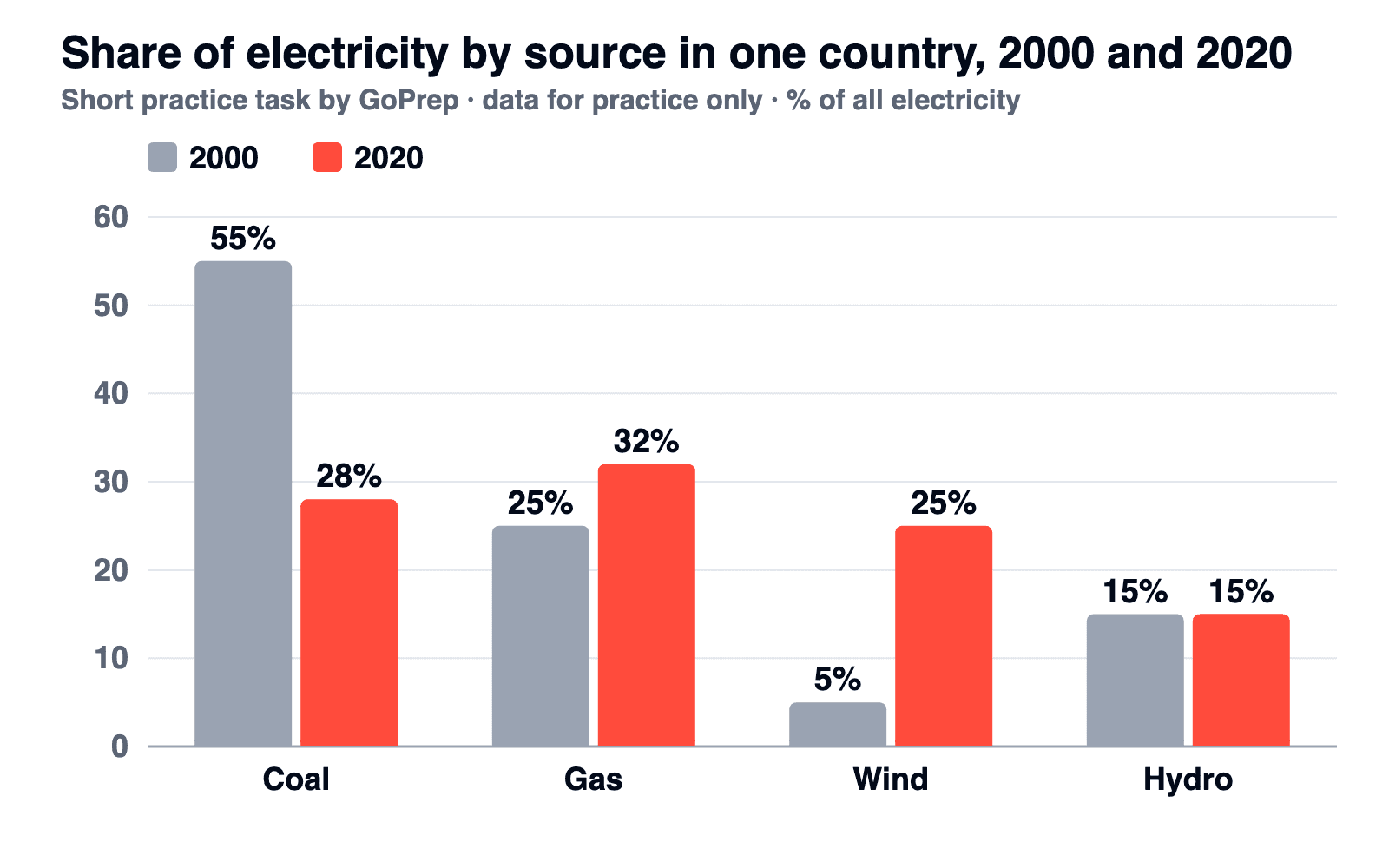
The chart shows the share of electricity produced from four sources in one country in 2000 and 2020. Summarise the information by selecting and reporting the main features, and make comparisons where relevant.
| Source | 2000 | 2020 |
|---|---|---|
| Coal | 55% | 28% |
| Gas | 25% | 32% |
| Wind | 5% | 25% |
| Hydro | 15% | 15% |
Before you read on, check your draft:
- Did you name the biggest fall and the biggest rise?
- Did you notice that the leading source changed?
- Did you leave detailed figures and reasons out?
Our overview
Overall, coal's share fell sharply while wind power grew rapidly, and by 2020 gas had replaced coal as the main source of electricity. Hydro's share did not change.
The first sentence carries the two main features. The second adds the stable source in five words. How we chose them:
| What we noticed | Where it goes | In our overview |
|---|---|---|
| Coal: biggest fall, lost first place | Overview | coal's share fell sharply |
| Wind: biggest rise, five times its 2000 share | Overview (the rise); body (the figures) | wind power grew rapidly |
| Gas: largest source by 2020 | Overview | gas had replaced coal as the main source |
| Hydro: unchanged | Overview, briefly | Hydro's share did not change |
| Exact percentages | Body paragraphs | Not used |
There is no single correct overview. This one puts the new leader first and is just as good:
Overall, gas became the country's main source of electricity as coal's share fell sharply, while wind power grew rapidly and hydro stayed the same.
If yours says the same in different words, it does the job. Here is how three common drafts miss it:
| Draft | What goes wrong | Fix |
|---|---|---|
| Overall, coal fell from 55% to 28% and wind rose from 5% to 25%. | It lists single values and misses the new leader | Name the trends in general words and add the new leader |
| In conclusion, the country is moving to clean energy to fight climate change. | A reason and a judgement the chart doesn't show | Describe only what the chart shows |
| Overall, the chart shows electricity from four sources in 2000 and 2020. | It repeats the introduction and names no feature | Replace it with the main features |
FAQ
Can I use numbers in a Task 1 overview?
Keep detailed figures for the body paragraphs and describe the big picture in general words such as rose, the largest or most. A year that marks a change or the number of stages in a process can be useful. IDP's guidance says you do not need to present data in the overview.
Is the overview the same as a conclusion?
No. An overview summarises the main features of the visual, and it can come after the introduction or at the end. IDP notes that a Task 1 response does not need a separate conclusion. Either way, don't add opinions, explanations or predictions of your own.
How long should a Task 1 overview be?
IELTS sets no length for it. As a guide, one or two sentences of about 20 to 40 words is usually enough. What the band descriptors ask for is that it is clear and identifies the main trends or differences.
Do I need an overview in General Training Task 1?
No. General Training Task 1 is a letter, and its band descriptors ask for a clear purpose and a consistent tone instead. The overview requirement is part of the Academic descriptors.
Where to go next
To practise the whole report around the overview, pick the chart type you find hardest from the guides linked above and write a full answer. On the computer-delivered test you type your answer, so practise typing a full report in 20 minutes.
A self-check tells you whether your overview is there. It can't tell you what band your whole report would get. The quiz asks for your target score and exam date, and GoPrep builds a personal study plan around your answers.
P.S. The GoPrep Writing course has a full lesson on the Task 1 report shape, including the overview.

GoPrep Team
GoPrep guide authors
We write about IELTS preparation using platform data and official exam materials.
All articles by GoPrep Team