An IELTS mixed chart task gives you two or more visuals in one Task 1: a line graph with a pie chart, a bar chart with a table, two pies side by side. The official format says Academic Task 1 may ask you to describe "one or more graphs, charts or tables", and the rules don't change when there are two: at least 150 words, about 20 minutes, and Task 2 still counts twice as much.
What changes is the job: twice the data in the same time. You write one report about both visuals, with one overview that covers both and a body that shows how they connect. Three questions, answered before you write, decide most of it:
- What does each visual measure? Name the unit: trips, dollars, percentages.
- Which time does each one cover? A trend over years, or a single moment?
- What links them? The same year, the same groups, one visual breaking down the other, or nothing at all.
Mixed charts pull answers in two directions. In GoPrep data, first answers on a mixed task were the longest of all seven Task 1 types: 171 words at the median, and 1 in 4 ran to 200 words or more. Yet 23% still fell short of 150. Across all 566 students, the average first score was 6.0 (each student's first mixed answer within 28 July to 26 September 2026, scored by the GoPrep AI examiner).
What the AI examiner suggested fixing also leans towards comparing and describing figures:
| Suggested fix | Mixed charts | All Task 1 types |
|---|---|---|
| Fix a comparison | 28% | 19% |
| Describe figures more precisely | 25% | 19% |
| Subject-verb agreement | 38% | 33% |
| Linking words and cohesion | 18% | 20% |
These are suggestions, not a full error count, and the gap doesn't show why it exists. But it tells you what to check first: comparisons and figures. The rest of this guide covers the three decisions that matter most: what to compare across the visuals, what goes in the overview, and how to plan the body.
What the examiner checks
Your Task 1 score is the average of four criteria of equal weight: Task Achievement, Coherence and Cohesion, Lexical Resource, and Grammatical Range and Accuracy. In the official band descriptors, three Task Achievement lines matter most when there are two visuals:
- Band 8: "The response covers all the requirements of the task appropriately, relevantly and sufficiently." With a mixed task, the requirements include every visual.
- Band 7: "It presents a clear overview, the data are appropriately categorised, and main trends or differences are identified."
- Band 5: "Key features which are selected are not adequately covered."
The descriptors don't mention mixed tasks by name. But a report that gives the second visual one line leaves part of the task under-covered, and one that lists both figure by figure has no clear overview.
Step 1: find what links the two visuals
Here is the practice task we'll use through the guide. Before you read on, give yourself 60 seconds and answer the three questions above: what does each visual measure, which time does each cover, and what links them?
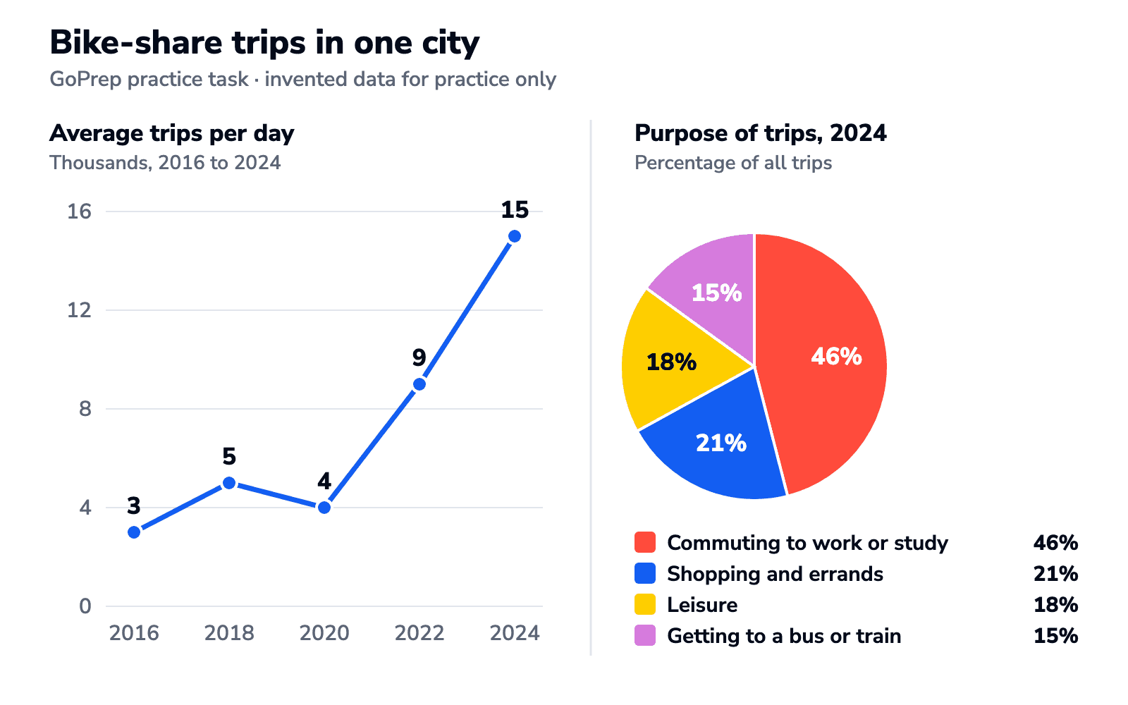
The answer. The line graph measures trips per day, in thousands, between 2016 and 2024. The pie chart measures percentages of trips in one year. The link is 2024: the pie breaks down the last point of the line. That tells you four things before you write:
- Tense: both visuals refer to past years, so use the past simple in the body.
- Change or comparison: the line shows change, so use change verbs (rose, dipped, climbed). The pie shows one year, so use proportion and ranking language (accounted for, the largest share), not change verbs.
- Units: the line is in thousands, so 15 means 15,000 trips. The pie is in percentages of those trips.
- The link you can use: 46% of 15,000 trips is about 6,900 commuting trips a day. One such sentence shows you read the two visuals as one set of data.
Most mixed tasks fall into one of four patterns. The link decides your plan:
| Combination | Typical link | Body plan |
|---|---|---|
| Line or bar over time + pie | The pie breaks down one year of the trend | By visual |
| Two pies or two tables with the same categories | Same categories, different years or places | By theme |
| Chart + table about the same groups | Same groups, different measures | By visual, or by group |
| Two visuals with nothing in common | Only the topic | By visual |
Step 2: choose a plan, by visual or by theme
The introduction (both visuals, paraphrased) and the overview (both visuals, summarised) are always the same. The choice is in the body.
Plan A: one body paragraph per visual. Use it when the visuals measure different things, as in the bike-share task:
- Body 1: the line: the rise, the 2020 dip, the jump after it.
- Body 2: the pie, ranked by share, plus an optional sentence linking it to the line.
Plan B: one body paragraph per theme. Use it when the visuals share categories. Two pie charts of household spending in 2000 and 2020 with the same six categories are really one comparison, so group the categories by behaviour:
- Body 1: the categories that grew between the two years, with both figures for each.
- Body 2: the categories that shrank or stayed the same.
More on Plan B in our pie chart guide.
A second case: same groups, different measures
A table gives visitors to three museums in 2010 and 2020, and a bar chart gives the share of 2020 visitors aged under 25 (invented figures):
- Science: 400,000 in 2010, 520,000 in 2020; 45% under 25
- Art: 350,000, then 300,000; 20% under 25
- History: 150,000, then 180,000; 30% under 25
The link is the three museums, and 2020 appears in both visuals. Grouping by museum works better than a paragraph per visual: body 1 on the Science museum, the largest in both years and the most popular with young visitors; body 2 on Art, the only one to lose visitors, and History. A calculation is safe for 2020 only: 45% of 520,000 is 234,000 young visitors. The bar chart says nothing about 2010, so don't estimate that year.
A possible overview: Overall, the Science museum attracted the most visitors in both years and the highest share of under-25s, while the Art museum was the only one to lose visitors.
Three or more visuals, or no link at all
With three or four visuals that share a measure and a period, group by theme (for example, trade partners where trade grew, then those where it fell) rather than writing a paragraph per visual. If two visuals share only a topic, don't invent a link: use Plan A and join the two halves of your overview with while or meanwhile.
How to write one overview for two visuals
Your overview needs to capture the main feature of both visuals. Start with Overall, and give the main feature of each visual, in one sentence or two. Keep detailed figures for the body. Three attempts for the bike-share task:
Covers one visual
Overall, the number of bike-share trips increased significantly between 2016 and 2024.
True, but the pie chart has disappeared. Half the task has no overview.
Two lists, not an overview
Overall, trips went from 3,000 to 15,000 a day. Commuting was 46%, shopping and errands 21%, leisure 18% and getting to a bus or train 15%.
Both visuals are there, but these are body details. Nothing is summarised.
A clear overview of both
Overall, bike-share use grew fivefold over the period, with most of the growth coming after 2020. In 2024, commuting was by far the most common purpose, accounting for almost half of all trips.
One main feature from each visual, no exact figures, and the second sentence picks up where the first ends (In 2024), so the two read as one picture. For a single visual, see how to write a Task 1 overview.
Linking language between visuals
For trend and comparison words, see our Task 1 vocabulary guide. A mixed task adds one job: moving between the visuals and connecting them.
| What you're doing | Useful language | Where it goes |
|---|---|---|
| Moving to the second visual | Turning to the pie chart, ... / As for the purposes of these trips, ... | Opening of the second body paragraph |
| Showing how they connect | The pie chart breaks this total down by purpose. | Start of the second body paragraph, or the introduction |
| Combining figures | Of the 15,000 daily trips, almost half (46%) were for commuting. | Once, when both figures describe the same things in the same year |
| Pointing back | this figure, these journeys, the same year | Any sentence after the first visual has been described |
One paragraph, three ways
Band scores apply to the whole answer, not to one paragraph. These three versions of the bike-share pie-chart paragraph show the moves the Task Achievement descriptors describe from band 6 to band 8: information "appropriately selected", then key features "covered and clearly highlighted", then key features "skilfully selected, and clearly presented, highlighted and illustrated".
Listed
The pie chart shows the purposes of trips in 2024. Commuting was 46%, shopping and errands was 21%, leisure was 18% and getting to a bus or train was 15%.
Correct and supported with data, but it reads the legend aloud: no ranking, no comparison.
Ranked and compared
Turning to the pie chart, commuting to work or study was the main purpose of bike-share trips in 2024, at 46%, more than double the share of shopping and errands (21%). Leisure accounted for a similar 18%, and the smallest share, 15%, went on getting to a bus or train.
A leader, a comparison (more than double) and a ranked order. This paragraph covers the pie chart clearly. Where useful, you can also connect it to the total shown in the line graph.
Ranked, grouped and linked
As for what these journeys were for, commuting dominated: in 2024 it accounted for 46% of all trips, or roughly 6,900 of the 15,000 made each day. Shopping and errands (21%) and leisure (18%) together made up 39%, while the remaining 15% of trips took riders to a bus or train.
These journeys points back to the line graph, together made up 39% groups two middle slices, and 6,900 of the 15,000 connects the visuals. That calculation works only because both figures describe the same trips in the same year. It's an option, not a requirement for a high score. (21% + 18% = 39%; 46% of 15,000 = 6,900.)
How long should a mixed chart answer be?
At least 150 words, and there is no official maximum. With two visuals, the risk runs both ways: running out of time before the second visual, or reporting so many figures that the answer turns into a list. In GoPrep data, mixed-chart answers were the longest first answers of any Task 1 type:
| Task 1 type | Median length | 200 words or more |
|---|---|---|
| Mixed charts | 171 words | 25% |
| Map | 169 words | 22% |
| Bar chart | 167 words | 18% |
| Table | 162 words | 16% |
| Line graph | 157 words | 14% |
| Pie chart | 155 words | 8% |
| Process | 154 words | 7% |
A sensible target for a mixed task is about 170 to 190 words: an overview of both visuals and selected figures from each. Past 200, check your body: are you reporting every point on the line and every slice of the pie? Cut figures that don't support a main feature and give those minutes to Task 2. More on keeping Task 1 inside 20 minutes.
Practice: a full mixed task with a model answer
Test-takers often say tasks with several charts eat into Task 2 time, so time yourself.
The line graph below shows the average number of bike-share trips made per day in one city between 2016 and 2024. The pie chart shows the purposes of these trips in 2024. Summarise the information by selecting and reporting the main features, and make comparisons where relevant.
| Year | Trips per day | Change since the previous year shown |
|---|---|---|
| 2016 | 3,000 | Starting point |
| 2018 | 5,000 | Up 2,000 |
| 2020 | 4,000 | Down 1,000 |
| 2022 | 9,000 | Up 5,000 |
| 2024 | 15,000 | Up 6,000 |
| Purpose | Share of trips | Rank |
|---|---|---|
| Commuting to work or study | 46% | 1st |
| Shopping and errands | 21% | 2nd |
| Leisure | 18% | 3rd |
| Getting to a bus or train | 15% | 4th |
Model answer (174 words)
The line graph shows the average number of bike-share trips made per day in one city between 2016 and 2024, while the pie chart shows what these trips were used for in 2024.
Overall, bike-share use grew fivefold over the period, with most of the growth coming after 2020. In 2024, commuting was by far the most common purpose, accounting for almost half of all trips.
In 2016, riders made an average of 3,000 trips a day. This figure rose to 5,000 in 2018 and dipped slightly to 4,000 in 2020, before climbing sharply to 9,000 in 2022 and 15,000 in 2024. In other words, the number of daily trips increased almost fourfold in the last four years alone.
Turning to the purposes of these journeys, 46% of trips in 2024 were made by people commuting to work or study, which equals roughly 6,900 of the 15,000 daily trips. Shopping and errands came second at 21%, followed closely by leisure at 18%. The remaining 15% of trips took riders to a bus or train.
Why it works:
- Both visuals in the introduction and the overview, the overview without exact figures.
- Plan A, one body paragraph per visual, because they measure different things.
- One link sentence (6,900 of the 15,000), and these journeys points back to the line.
- Past simple throughout, with change verbs for the line (rose, dipped) and ranking language for the pie (came second).
Arithmetic: 3,000 to 15,000 is fivefold; 4,000 to 15,000 is almost fourfold.
FAQ
What is a mixed chart task in IELTS Writing Task 1?
It is an Academic Task 1 with two or more visuals, such as a line graph and a pie chart, or a bar chart and a table. You write one report of at least 150 words about all of them in about 20 minutes.
Do I have to compare the two charts in a mixed task?
Make comparisons where the data allows it, for example when both visuals cover the same year or the same groups. If the visuals share only a topic, describe the main feature of each and don't invent a connection.
How many words should I write for IELTS Task 1 with two charts?
At least 150 words. About 170 to 190 words is usually enough to cover both visuals with an overview and selected figures. Much longer answers often list too many figures and take time from Task 2.
Where to practise next
Mixed tasks are built from the single types. In GoPrep data, mixed charts had fewer short first answers than most types, and the same rounded average first score as bar charts, tables, maps and process diagrams.
| Task 1 type (students) | Under 150 words | No summary words | Average first band |
|---|---|---|---|
| Pie chart (1,186) | 37% | 26% | 5.5 |
| Line graph (1,453) | 35% | 20% | 5.5 |
| Process (537) | 32% | 19% | 6.0 |
| Table (239) | 26% | 8% | 6.0 |
| Bar chart (417) | 24% | 11% | 6.0 |
| Mixed charts (566) | 23% | 16% | 6.0 |
| Map (371) | 18% | 11% | 6.0 |
If one half of a mixed task slows you down, practise that type on its own: trends in our line graph guide, selecting figures in the table guide.
On your next mixed task, before you write, say the link between the visuals in one sentence. If you can, your overview is half written. Then make a plan for the rest of the exam: tell the quiz your target score, your exam date and the part of IELTS you find hardest, and GoPrep will build a personal study plan around your answers.

GoPrep Team
GoPrep guide authors
We write about IELTS preparation using platform data and official exam materials.
All articles by GoPrep Team