A pie chart shows how one total, such as a budget, a population or a working day, is split into parts. Every slice is a share of the whole, and together they make 100%. So the key question isn't "what changed over time?", as in a line graph, but "which slice is biggest, which is smallest, and how do they compare?"
You may get one pie or several. Two pies often show the same categories in different years, and then you also report how each share changed. Sometimes they show different groups, such as two countries, in the same year. A pie can also come with a different kind of chart, such as a line graph: see our guide to mixed charts. As with every Academic Task 1, spend about 20 minutes and write at least 150 words.
In GoPrep data, pie charts had a higher share of short first answers than any other Task 1 type, and of answers with none of the usual summary words, such as overall or in general:
| Task 1 type (students) | Under 150 words | No summary words | Average first band |
|---|---|---|---|
| Pie chart (1,186) | 37% | 26% | 5.5 |
| Line graph (1,453) | 35% | 20% | 5.5 |
| Process (537) | 32% | 19% | 6.0 |
| Table (239) | 26% | 8% | 6.0 |
| Bar chart (417) | 24% | 11% | 6.0 |
| Mixed charts (566) | 23% | 16% | 6.0 |
| Map (371) | 18% | 11% | 6.0 |
A summary word is only a marker: overall doesn't prove a real overview, and a good overview can do without it. The pattern is fixable, though: when students tried again, 101 of 155 with a short first answer reached 150 words, and 48 of 94 used a summary word in their next answer. This guide focuses on the overview and on the language that turns a list of percentages into a report.
What the examiner checks
Your answer gets four scores of equal weight: Task Achievement, Coherence and Cohesion, Lexical Resource, and Grammatical Range and Accuracy. Two lines from the official band descriptors matter most for pie charts. Band 7 asks for "a clear overview" in which "the data are appropriately categorised": you group the slices instead of taking them one by one. At band 5, "the recounting of detail is mainly mechanical", which is exactly what a report that reads out every percentage sounds like.
The 4-paragraph structure
- Introduction. One sentence that paraphrases the task: what the chart shows, where and when.
- Overview. One or two sentences on the biggest and smallest slices and the main change or difference.
- Body paragraph 1. The first group of slices, with figures.
- Body paragraph 2. The remaining slices, with figures and comparisons.
This is a convenient layout you can adapt to the task.
How you group depends on the task:
- One pie: by size, the large slices first, then the small ones.
- Two pies from different years: by what happened, the shares that grew, then those that shrank or stayed stable (Practice 1 below).
- Two groups in the same year: by comparison, what the groups have in common, then where they differ (Practice 2 below).
The introduction takes the present tense (The charts show...), figures for past years the past simple (housing accounted for 38% in 2010).
How to write the overview
Start with Overall, and answer one question: what would someone remember after two seconds with the chart? Usually the largest slice, the smallest, and whether one slice takes the majority. For pies from different years, add the biggest change; for different groups, the biggest difference. Leave the exact figures for the body. For overviews of every chart type, see how to write a Task 1 overview.
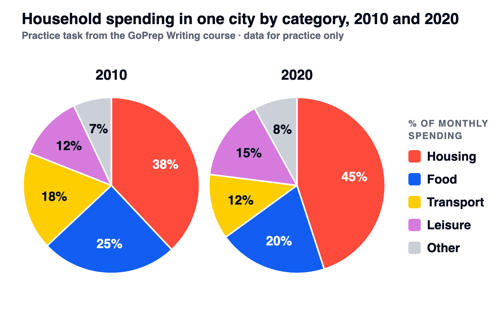
Our main practice task: how households in one city split their spending in 2010 and 2020.
Two separate overviews
Overall, in 2010 housing was the largest category. In 2020, housing was also the largest category.
True, but it misses the change between the two years, which is the reason the task gives you two pies.
A clear overview
Overall, housing took the largest share of spending in both years and its lead widened, while other items remained the smallest category. Food and transport, by contrast, accounted for a smaller part of the budget by 2020.
No figures: the largest slice, the smallest, one direction of change, one contrast. An overview like this shows the examiner that you read two pies as one story.
Proportion language: percentages, fractions and comparisons
A report that says Housing was 38%. Food was 25%. copies the chart. The problem isn't the percentages: it's that the figures sit side by side with no link between them. A stronger report ties each slice to the whole with a verb and compares it with another slice: Food accounted for 25% of spending, compared with 18% for transport. Portion phrases give you a second way to say a figure:
| Share | Portion phrase | Example |
|---|---|---|
| 45 to 49% | almost half, just under half | By 2020, housing took up almost half of the budget. |
| 25% | a quarter | Food made up a quarter of spending in 2010. |
| 20% | a fifth | Its share fell to a fifth by 2020. |
| Under 10% | a small fraction, a tiny proportion | Other items represented only a small fraction of the total. |
| Biggest or smallest slice | the largest share, the smallest proportion | Housing had the largest share in both years. |
Four verbs link a slice to the whole: account for, make up, represent and take up. Mix percentages and portion phrases where it helps accuracy, and keep the real figure nearby, because the band 6 descriptor wants information "supported using figures/data": just under two fifths of spending (38%). There's no set number of portion phrases. More words for all Task 1 types are in our Task 1 vocabulary guide.
Five common kinds of fixes the GoPrep AI examiner suggests in pie chart answers are small and easy to check:
| Error | How often | What to check |
|---|---|---|
| Subject-verb agreement | 37% | The proportion of spending was: the verb agrees with proportion. After a fraction, the verb agrees with the noun after of: a quarter of the budget was, a quarter of students were. |
| Comparisons | 28% | bigger, not more bigger; the largest share, not the most largest share. |
| Prepositions | 24% | accounted for 38%; rose from 38% to 45%; by for the size of the change. |
| Describing figures precisely | 22% | 45% is almost half, not half. 38% to 45% is a rise of 7 percentage points, not 7%. |
| Spelling | 18% | Category names copied from the chart, and proportion, percentage. |
Comparing two pie charts
First check what the pies show. The same group in different years: compare changes. Different groups in the same year (two towns in 2024, say): compare the sizes of the shares, without change verbs like rose or fell. Practice 2 below is this second kind.
With pies from different years, the weak route describes the first pie, then the second, and leaves the reader to find the differences:
In 2010, food made up 25% and transport 18%. In 2020, food made up 20% and transport 12%.
The strong route follows one slice across both charts in a single sentence:
Food's share fell from a quarter to a fifth over the decade, while transport shrank from 18% to 12%.
Three tools help:
- Contrast linkers: while, whereas, by contrast.
- Reference words instead of repeated names: this, the former, the latter.
- Selection: five slices in two pies make ten numbers. Report the leader, the smallest, the biggest change and any change in rank. A one-point change gets a short mention or none.
With bars instead of slices, the logic is similar: see our bar chart guide.
Practice 1: two pie charts with a model answer
This task is from the GoPrep Writing course.
The two charts above show how a typical household in one city divided its monthly spending across five categories in 2010 and 2020. Summarise the information by selecting and reporting the main features, and make comparisons where relevant.
| Category | 2010 | 2020 |
|---|---|---|
| Housing | 38% | 45% |
| Food | 25% | 20% |
| Transport | 18% | 12% |
| Leisure | 12% | 15% |
| Other | 7% | 8% |
Model answer (167 words)
The two pie charts compare how a typical household in one city divided its monthly spending among five categories in 2010 and 2020.
Overall, housing took the largest share of the budget in both years and its lead widened, while other items remained the smallest category. Food and transport accounted for a smaller proportion by 2020, and leisure moved ahead of transport.
Three categories gained ground. Housing already made up the biggest slice in 2010, at just under two fifths of all spending (38%), and by 2020 this had risen to 45%, close to half of the total. The share spent on leisure also grew, from 12% to 15%, while other items edged up from 7% to 8%.
The remaining two categories moved the other way. Food, the second-largest category in both years, fell from a quarter to a fifth of the budget. Transport shrank even more, from 18% to 12%, or roughly an eighth of spending, so it dropped from third place to fourth, behind leisure.
Why it works: the overview has no figures, the body groups the slices by what happened to them, and each slice is followed across both years in one sentence. The table shows how much space each slice gets and why:
| Slice | 2010 → 2020 | In the model answer | Why |
|---|---|---|---|
| Housing | 38% → 45% | Overview and a full sentence | Largest in both years, biggest rise |
| Food | 25% → 20% | Overview and a full sentence | Second in both years, down 5 points |
| Transport | 18% → 12% | Overview, a full sentence and its new rank | Biggest fall, from third place to fourth |
| Leisure | 12% → 15% | Overview and half a sentence | It overtook transport |
| Other | 7% → 8% | Overview and a short clause | Smallest slice, 1-point change |
Editing a weak answer on the same task
A short, mechanical first attempt (our own example, 61 words):
The charts show household spending in 2010 and 2020. In 2010, housing was 38%, food was 25%, transport was 18%, leisure was 12% and other was 7%. In 2020, housing was 45%, food was 20%, transport was 12%, leisure was 15% and other was 8%. Housing increased by 7% and people spent less money on food. Overall, housing is the biggest.
The chart percentages are copied correctly, but the change is misstated and the claim about money spent is unsupported. Four edits turn it into a report; the full answer still needs at least 150 words:
| What to fix | Before | After |
|---|---|---|
| Overview | Overall, housing is the biggest. Names only the largest slice and misses the main changes between the years. | Overall, housing took the largest share in both years and its lead widened, while other items remained the smallest category. Second paragraph. |
| Grouping | One pie, then the other: ten figures in chart order. | The three shares that grew, then the two that shrank. |
| Comparison | In 2010, transport was 18%... In 2020, transport was 12%, leisure was 15%. | Transport shrank from 18% to 12%, dropping from third place to fourth, behind leisure. |
| Share accuracy | Housing increased by 7% and people spent less money on food. | Housing's share rose by 7 percentage points, while food's share fell. |
Practice 2: two towns in the same year
Now a different kind of task: two groups at one moment, with the totals given.
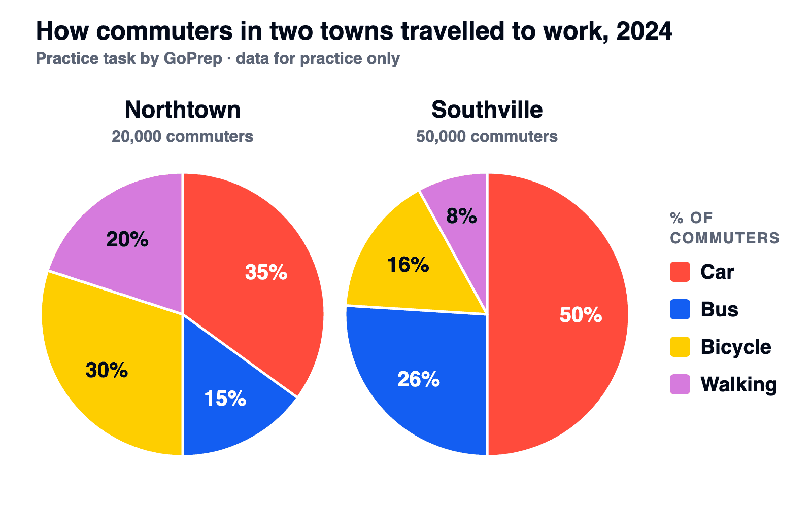
The pie charts show how commuters in two towns travelled to work in 2024. Summarise the information by selecting and reporting the main features, and make comparisons where relevant.
| Way to work | Northtown (20,000 commuters) | Southville (50,000 commuters) |
|---|---|---|
| Car | 35% | 50% |
| Bus | 15% | 26% |
| Bicycle | 30% | 16% |
| Walking | 20% | 8% |
Short solution
Nothing changes over time here, so skip rose and fell and group by comparison: what the towns share, then where they differ.
Overall, the car was the most common way to get to work in both towns, but cycling and walking played a much bigger role in Northtown, while buses were more important in Southville.
Now the trap. In Northtown 30% of commuters cycled to work, and in Southville 16%, so it's tempting to say more people cycled in Northtown. But the totals are given: 30% of 20,000 is 6,000 people, and 16% of 50,000 is 8,000. The smaller share is the larger group:
Although a larger proportion of commuters cycled to work in Northtown (30%, compared with 16%), the number of cyclists was higher in Southville: 8,000 versus 6,000.
Walking gives a different result: the shares differ, but 20% and 8% are both 4,000 people. Without totals, compare shares only.
FAQ
How many words should a pie chart answer have?
At least 150. With two pies, 160 to 190 words is usually enough to follow each key slice across both years without cutting into your Task 2 time.
How do I compare two pie charts in IELTS?
If the pies show the same group in different years, write one overview for both and follow each important slice across the years in one sentence. If they show different groups in the same year, compare the sizes of the shares instead.
Which tense should I use for a pie chart?
Present simple for the introduction ("The charts show..."), past simple for figures from past years, and forms like "is expected to account for" for a projected year.
What if a pie chart comes with a table or another chart?
Write one overview that covers both visuals together, then use the body paragraphs for the details of each.
Do I need a conclusion in a pie chart answer?
No. Task 1 needs an overview, not a conclusion. You can place the overview right after the introduction or at the end, but don't add opinions or reasons that the chart doesn't show.
Is Task 1 harder than Task 2?
Neither is harder for everyone: Task 1 tests how well you select and describe data, Task 2 how well you argue a position. Task 2 carries twice as much weight, so keep Task 1 to about 20 minutes and leave 40 for the essay.
Where to practise next
Check your own pie chart report against this guide: an overview, grouped slices, figures linked to the whole. Then plan the rest. Tell the quiz your target score, your exam date and the part of IELTS you find hardest, and GoPrep will build a personal study plan around your answers.

GoPrep Team
GoPrep guide authors
We write about IELTS preparation using platform data and official exam materials.
All articles by GoPrep Team