An IELTS Task 1 table gives you rows and columns of numbers and nothing else: no line to follow, no slices to compare. Every figure looks equally important, so the temptation is to report them all. Don't. The skill being tested is choosing: find the few figures that carry the story, group the rows that behave alike and report those. As with any Academic Task 1, aim to spend about 20 minutes and write at least 150 words, and remember that Task 2 counts twice as much.
Before you write, run three quick checks:
- Change or a snapshot? Does the table show several points in time or one moment?
- Circle the extremes. The highest figure, the lowest, the biggest change and the row that breaks the pattern.
- Group the rows. Decide which rows share a paragraph.
In GoPrep data, the first table answer scored 6.0 on average (239 students, 28 July to 26 September 2026, scored by the GoPrep AI examiner). Of the 27 students whose first table answer was under 150 words and who tried again, 22 reached 150 in the next attempt. But enough words don't show whether the right figures were chosen. What goes wrong most often, and what to check:
| What goes wrong | How often | What to check |
|---|---|---|
| First answer under 150 words | 26% of first answers | Add a comparison between your groups, not more cells |
| The AI examiner suggested describing figures more precisely | 22% of answers | Exact value with its unit: 620,000 households, not 620 |
| The AI examiner suggested fixing a comparison | 21% of answers | Both sides named: more households used gas than electric heating |
What the examiner checks
Your answer gets four scores of equal weight (Task Achievement, Coherence and Cohesion, Lexical Resource, Grammatical Range and Accuracy), and the Task 1 band is their average. For tables, three Task Achievement lines of the official band descriptors matter most. At band 5, "the recounting of detail is mainly mechanical", which is exactly what reading a table cell by cell produces. Band 6 asks for information that is "appropriately selected and supported using figures/data". Band 7 asks for "a clear overview", with the data "appropriately categorised" and the main trends or differences identified. Selecting and grouping are not extras for a table: they are what the examiner is looking for.
Step 1: check whether the table shows change over time
Read the task and the labels on the rows and columns. Time can sit in either, or only in the task wording, and it may be months or periods rather than years.
- Several points in time (2005, 2012, 2019): describe change. Use rose, fell, overtook, remained stable and the past simple for past years.
- One moment (beef, chicken and fish eaten in 2015): there is no movement, only a snapshot. Compare the categories (the most, twice as much, whereas) and never use trend verbs. A past year takes the past simple; no date at all takes the present simple.
Your introduction stays in the present either way, because it describes the table itself: The table shows...
Step 2: circle the extremes
We'll use this practice table from the GoPrep Writing course throughout the guide. Before reading on, give yourself 30 seconds: which figure is the highest, which is the lowest, and which row changed the most?
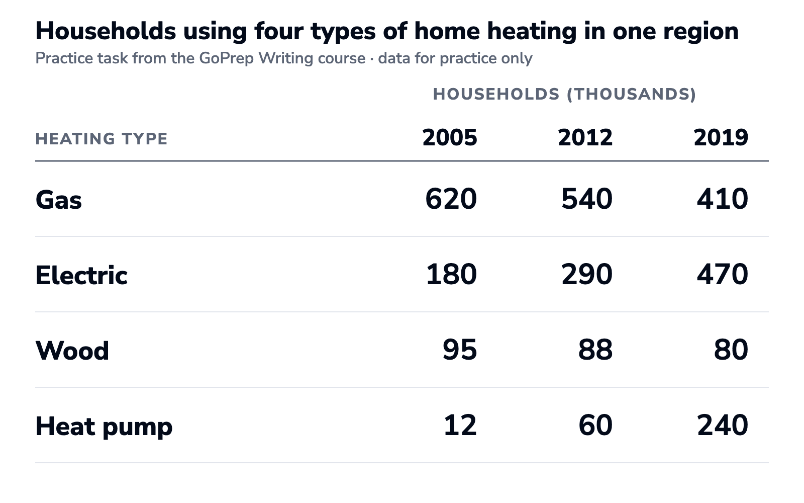
Hunt for four kinds of figure:
- The highest and the lowest value in the whole table.
- The biggest change, in size or in proportion.
- A change in ranking: does anything overtake anything?
- The exception: the row that doesn't move like the others.
For this table, start with four anchor cells. They point you to the main features; then check the direction of every row and any change in leader against the rest of the table.
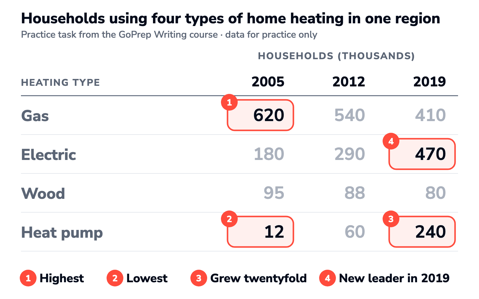
Wood is the exception: it barely moves, from 95,000 to 80,000 households. One short sentence covers the whole row.
Step 3: group the rows
Decide on groups before you write, and give each group one body paragraph. Three ways to group:
- By direction: the rows that rise in one paragraph, the rows that fall in the other.
- By size: the large figures together, the small ones together.
- By category: rows that belong together by meaning, such as imports and exports.
For the heating table, direction works best: gas and wood lost households, while electric heating and heat pumps gained them. For a table without change over time, group by size or by category instead.
Use the overview to summarise the main patterns, and normally save detailed figures for the body. Each body paragraph needs real figures from the table.
One body paragraph at band 6, 7 and 8
The rising group, written three ways. The bands are our reading of the Task Achievement descriptors for this paragraph, not a score for a whole answer.
Band 6: selected, but listed
Electric heating was 180,000 in 2005 and 470,000 in 2019. Heat pumps were 12,000 in 2005 and 240,000 in 2019.
The figures are well chosen and supported with data, as band 6 asks. But each row stands alone, with no comparison, and 180,000 of what? Households is missing.
Band 7: grouped and compared
Electric heating and heat pumps both spread. Electric heating rose from 180,000 households to 470,000 and overtook gas, while heat pumps climbed from 12,000 to 240,000.
The key features are "clearly highlighted": one group, a comparison, a new leader. Missing: what makes heat pumps stand out.
Band 8: selected and illustrated
Electric heating gained the most households: used by 180,000 in 2005, fewer than a third of the gas figure, it reached 470,000 by 2019 and overtook gas. Heat pumps grew even faster in proportion, from 12,000 to 240,000, and most of that rise came after 2012.
Band 8 asks for key features that are "skilfully selected, and clearly presented, highlighted and illustrated". Every figure here has a job: fewer than a third sets up the overtaking, and after 2012 shows when the heat-pump growth happened.
How to write the overview
Start with Overall, and write down the pattern your circled cells point to, keeping detailed figures for the body. Here are two attempts for the heating table.
Cell by cell
In 2005, 620,000 households used gas, 180,000 used electric heating, 95,000 used wood and 12,000 used heat pumps.
Every number is correct, but this is the first column read aloud, not an overview.
A clear overview
Overall, gas and wood heating declined while electric heating and heat pumps grew, and by 2019 electricity had overtaken gas as the most common method. Heat pumps recorded the largest proportional increase.
Two groups, a change in leader and the largest proportional rise: that shows the examiner you found the main features rather than copying twelve figures. For overviews of every chart type, see how to write a Task 1 overview.
Language for tables
A table report mostly compares and ranks, so these patterns do most of the work. If the table shows change over time, add the trend verbs from our line graph guide.
| What you're doing | Useful language |
|---|---|
| Highest and lowest | the most common, the largest number of, the smallest |
| Comparing two figures | twice as many as, far more than, whereas |
| Change over time | rose from ... to, fell by, overtook |
| Little or no change | changed little, edged down, remained stable |
| Moving to the next group | Turning to..., As for..., In terms of... |
| Size of a change | doubled, quadrupled, twentyfold |
Put together: In 2005, gas was used by more than three times as many households as electric heating, but by 2019 electric heating had overtaken it.
Paraphrase the words that carry meaning, such as using → relied on, and leave the technical ones alone: total, figure, number, percentage. Turning total into aggregate sum reads as strain, not range. And report what you see, never why: gas fell because prices went up is a guess the table can't support.
The grammar fixes GoPrep suggests most often in table answers (444 table answers with a Band Contract, 28 July to 26 September 2026, suggested by the GoPrep AI examiner; one answer can get several):
- Subject-verb agreement, in 31% of answers: The number of households using gas were → The number of households using gas was. The verb agrees with number.
- Prepositions and articles, in 25% and 24%: rose from 12,000 to 240,000, in 2005, by 2019; Gas was the most common type, not Gas was most common type.
- Punctuation and sentence boundaries, in 21%, for example a run-on: Gas fell to 410,000, electric heating rose to 470,000 → Gas fell to 410,000, while electric heating rose to 470,000.
Practice: a full table task with a model answer
This task is from the GoPrep Writing course. It's the heating table you've been working with.
The table below shows the number of households (in thousands) using four types of home heating in one region in 2005, 2012 and 2019. Summarise the information by selecting and reporting the main features, and make comparisons where relevant.
| Heating type | 2005 | 2012 | 2019 |
|---|---|---|---|
| Gas | 620 | 540 | 410 |
| Electric | 180 | 290 | 470 |
| Wood | 95 | 88 | 80 |
| Heat pump | 12 | 60 | 240 |
Model answer (168 words)
The table compares how many households in one region, in thousands, relied on four types of home heating in 2005, 2012 and 2019.
Overall, gas and wood heating became less common over the period, while electric heating and heat pumps spread quickly. By the end, electricity had replaced gas as the most widely used method, and heat pumps had recorded the largest proportional increase.
Turning to the methods that lost ground, gas was by far the most common type in 2005, used by 620,000 households, but this figure declined throughout, reaching 410,000 by 2019. Wood heating, which was much less widespread, edged down only slightly, from 95,000 to 80,000 households.
As for the methods on the rise, electric heating climbed from 180,000 households to 470,000, overtaking gas by the end of the period. The most striking change, however, was in heat pumps. They were used by just 12,000 households in 2005 and by 60,000 in 2012, but this number then quadrupled to 240,000, twenty times the starting figure.
Why it works: the overview names both groups, the change of leader and the largest proportional increase. The body is grouped by direction and signposted (Turning to, As for), and every figure keeps its unit. Nine of the twelve figures appear, and each one has a reason to be there:
| Row | Used | Left out | Why |
|---|---|---|---|
| Gas | 620, 410 | 540 | Start and end show the fall; 540 only confirms the direction |
| Electric | 180, 470 | 290 | Start and end show the rise and the new lead over gas (470 vs 410) |
| Wood | 95, 80 | 88 | One sentence is enough for a row that barely moves |
| Heat pump | 12, 60, 240 | none | 60 shows that most of the growth came after 2012: +48,000 before, +180,000 after |
"The biggest increase" depends on how you measure it: electric heating gained the most households (+290,000), heat pumps grew the most in proportion (twentyfold). That's why the model answer says largest proportional increase.
Second practice: a table with one year
Now try the method on a table with no change over time (invented practice data). Give yourself two minutes: what leads in each town, which row is the exception, and how would you group the body?
The table below shows the main way commuters travelled to work in three towns in 2023. Summarise the information by selecting and reporting the main features, and make comparisons where relevant.
| Main mode | Northfield | Eastbay | Southport |
|---|---|---|---|
| Car | 62 | 35 | 28 |
| Bus | 18 | 40 | 12 |
| Bicycle | 5 | 10 | 41 |
| Walking | 15 | 15 | 19 |
Short solution
- Snapshot, not change. One year, so compare and use the past simple for 2023. No rose or fell.
- The leader differs by column: the car in Northfield (62%), the bus in Eastbay (40%) and the bicycle in Southport (41%). The exception is walking, at 15% to 19% in all three towns.
- Group by mode, not by town. Cars and buses in one paragraph, cycling and walking in the other: each paragraph then compares all three towns.
A tempting but weak overview:
Overall, the car was the most popular way to travel to work.
It is true for one town out of three: reading only the first row hides the real pattern.
A clear overview:
Overall, each town relied on a different main mode of transport: the car in Northfield, the bus in Eastbay and the bicycle in Southport. Walking accounted for a similar share in all three.
One body sentence that selects and compares: In Southport, 41% of commuters cycled, more than eight times the share in Northfield (5%).
FAQ
How do you describe a table in IELTS Writing Task 1?
A useful structure is four paragraphs: an introduction that paraphrases the task, an overview of the main patterns, and two body paragraphs that group the rows with figures. Report the key figures, not every cell.
How do I start a Task 1 table answer?
Paraphrase the task in one sentence. Change the verb (shows → compares), rephrase the noun phrase (the number of households → how many households) and keep the units, places and years exact. Add no figures and no opinion, then go straight on to the overview.
Do I have to mention every number in the table?
No. The task asks you to select and report the main features. Mention the highest and lowest values, the biggest changes and any exception, and leave out figures that add nothing to the picture.
Do I need an overview for a table?
Yes. The band 7 descriptor for Task Achievement asks for a clear overview. For a table, it names the biggest pattern across all rows and columns, such as which category leads.
What tense should I use to describe a table?
Follow the dates. Past years take the past simple, future projections take forms like "is expected to", and a table with no date at all takes the present simple. The introduction stays in the present: "The table shows..."
Can I round the numbers from a table?
Yes, if the picture stays accurate. Quote the key figures with their unit, and use approximate words such as "about three times as many" or "almost a quarter" where they don't change what the data shows. They work especially well when you compare two figures. This is our advice, not an IELTS rule: the descriptors ask for accurate data.
How many words should a Task 1 table answer have?
At least 150, written in about 20 minutes. Between 160 and 190 words fits the key figures from each group. Going far beyond that is often a sign you're reporting too many cells, and it eats into your Task 2 time.
Where to practise next
The same selecting habit works for every chart. In GoPrep data, tables sit in the middle of Task 1 types for short first answers: fewer than pie charts and line graphs, more than maps.
| Task 1 type (students) | Under 150 words | No summary words | Average first band |
|---|---|---|---|
| Pie chart (1,186) | 37% | 26% | 5.5 |
| Line graph (1,453) | 35% | 20% | 5.5 |
| Process (537) | 32% | 19% | 6.0 |
| Table (239) | 26% | 8% | 6.0 |
| Bar chart (417) | 24% | 11% | 6.0 |
| Mixed charts (566) | 23% | 16% | 6.0 |
| Map (371) | 18% | 11% | 6.0 |
A bar chart often holds the same kind of data as a table, just drawn as bars, and the Task 1 vocabulary guide collects the comparison language in one place.
Whatever you write next, ask of each figure: which main feature or comparison does it support? If none, cut it. Then make a plan. Tell the quiz your target score, your exam date and the part of IELTS you find hardest, and GoPrep will build a personal study plan around your answers.

GoPrep Team
GoPrep guide authors
We write about IELTS preparation using platform data and official exam materials.
All articles by GoPrep Team