A bar chart sets quantities side by side as bars of different heights: countries, age groups or products along one axis, a number or a percentage along the other. For Academic Writing Task 1, aim to spend about 20 minutes and write at least 150 words to describe it, and Task 2 counts twice as much.
The examiner isn't checking whether you can read every bar. They're checking whether you can group the bars and compare them. One quick check comes first, because it decides your tense and your vocabulary: does the chart show change over time, or a single moment?
In GoPrep data, 24% of first bar chart answers were under 150 words, and 8% had none of the usual comparison words such as whereas, than or compared with (417 students, 28 July to 26 September 2026). Of the 32 students with a short first answer who tried again, 26 reached 150 words. Length alone doesn't replace grouping and comparison, though, so most of this guide is about those two.
Bar chart answers run short less often than most other Task 1 types:
| Task 1 type (students) | Under 150 words | No summary words | Average first band |
|---|---|---|---|
| Pie chart (1,186) | 37% | 26% | 5.5 |
| Line graph (1,453) | 35% | 20% | 5.5 |
| Process (537) | 32% | 19% | 6.0 |
| Table (239) | 26% | 8% | 6.0 |
| Bar chart (417) | 24% | 11% | 6.0 |
| Mixed charts (566) | 23% | 16% | 6.0 |
| Map (371) | 18% | 11% | 6.0 |
What the examiner checks
Your answer gets four scores of equal weight, and the Task 1 band is their average:
- Task Achievement: grouped bars, an overview of the main differences, figures to back them.
- Coherence and Cohesion: clear paragraphs and helpful linking.
- Lexical Resource: range and accuracy of vocabulary.
- Grammatical Range and Accuracy: varied, correct sentences.
Two lines of the official band descriptors matter most here. At band 7, the report presents "a clear overview", the data are "appropriately categorised", and "main trends or differences are identified". At band 5, the recounting of detail is "mainly mechanical": walking along the bars one sentence at a time. And note the word differences: a chart that shows a single moment has no trends, only differences.
First check: does the chart show change over time?
Look at the horizontal axis and the legend. If the categories are groups (countries, age groups, products) and there is no sequence of dates, the chart is a comparison: it shows how categories differ at one moment. If the chart shows points in a sequence (two or more years, or months and days in order), it shows change over time, and you also describe what changed, much as you would in a line graph.
| Check | One moment (no sequence of dates) | Change over time (two or more points in time) |
|---|---|---|
| Example | The share of households owning each of four devices, by age group | How commuters travelled to work in 2010 and 2020 |
| Your job | Compare the bars: highest, lowest, biggest gaps | Compare the bars and describe what changed between the dates |
| Tense | Follow the task wording. No date and no other time clue: present simple. A past year: past simple | Past simple for past years, is expected to for projections |
| Rise, fall, increase | No: the chart shows no change over time | Yes, for change between the dates |
| Sample sentence | Smart speakers are found in 75% of younger households, compared with 20% of older ones. | The share of commuters who cycled more than doubled, from 6% to 13%. |
Where the dates sit also tells you how to group:
- Years along the bottom axis, one bar per year: a trend drawn with bars. Use trend language.
- Years in the legend, two or three bars per category: compare the categories, then say which changed most (the second practice task below).
- No sequence of dates: compare only. Average rainfall by season, with no particular year, is a comparison: rainfall is highest in winter, not rainfall rose in winter. If the chart shows the seasons of one specific year in order, you can describe changes between them.
The 4-paragraph structure
A reliable starting point is four paragraphs:
- Introduction. One sentence that paraphrases the task: shows becomes compares, the percentage of households owning becomes the share of homes with.
- Overview. One or two sentences on the main differences (and the biggest change, if the chart shows time), with no figures.
- Body paragraph 1. The first group of bars, with figures and comparisons.
- Body paragraph 2. The second group, with figures and comparisons.
The grouping does the heavy lifting. Split the bars by who leads, by height (tall against short) or, on a time chart, by what rose against what fell. Every body paragraph needs figures: at band 6 the descriptors already expect information "supported using figures/data".
How to write the overview for a bar chart
You can start with Overall, and answer one question: which bars stand out, and how do the groups differ? If the chart shows time, add the biggest change. Keep the figures for the body. For overviews of every chart type, see how to write a Task 1 overview.
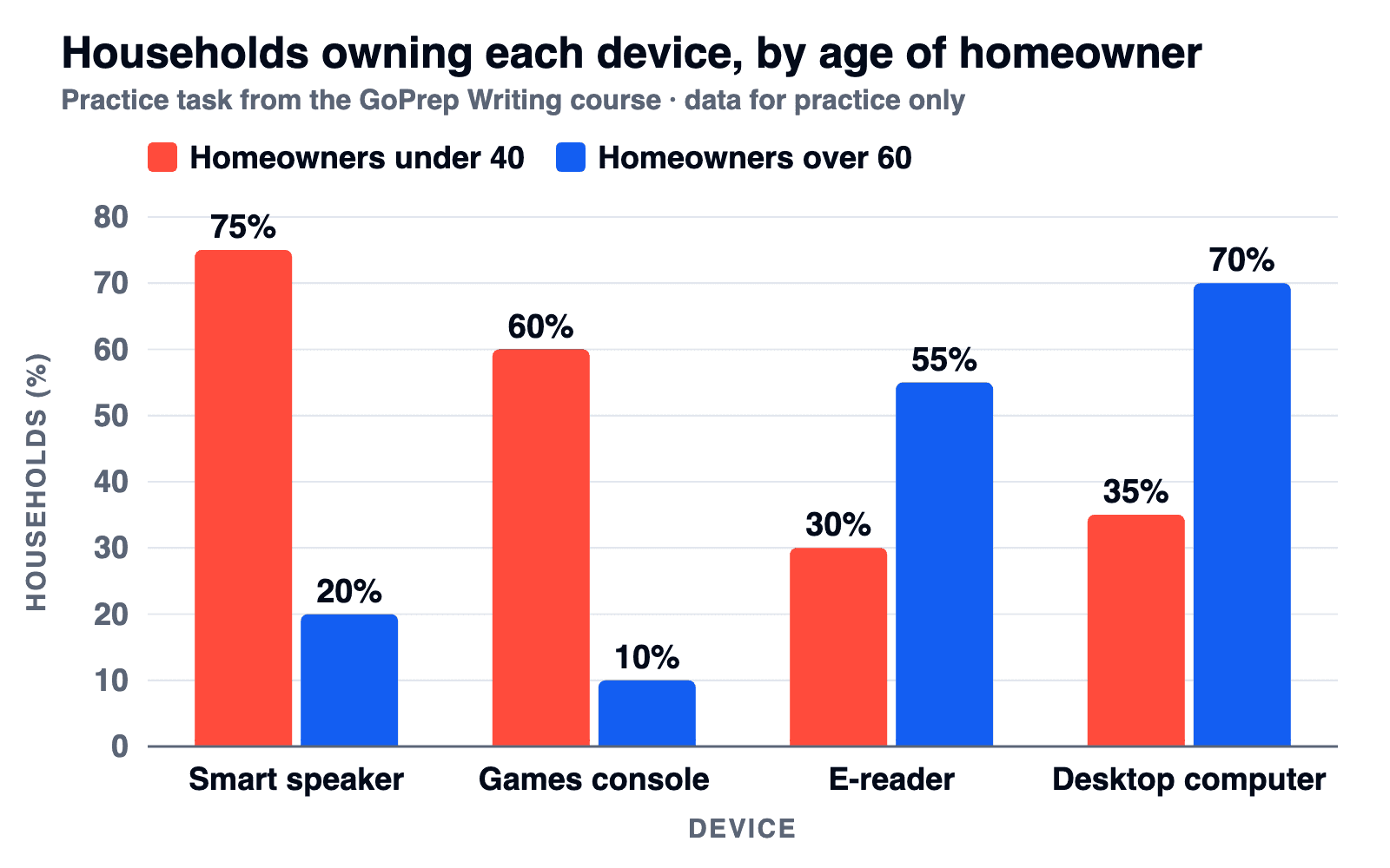
We'll use this practice chart from the GoPrep Writing course throughout the guide: four devices, two age groups, no date.
Every bar in order
Smart speakers are owned by 75% of under-40s and 20% of over-60s. Games consoles are owned by 60% of under-40s and 10% of over-60s.
The figures are right, but it's a list: no grouping, no comparison, and the reader has to find the pattern alone.
Trend words on a one-moment chart
Overall, smart speaker ownership rose to 75%, while desktop ownership increased among older people.
The chart shows no change over time, so nothing rose.
A clear overview
Overall, smart speakers and games consoles are far more widely owned among younger households, whereas e-readers and desktop computers are more common among older households.
An overview that names the relationship
Overall, the two age groups show almost opposite patterns: each leads clearly on one pair of devices and trails on the other.
Both group the devices by who leads, with no figures, and the second names the pattern behind the groups. It won't lift a report on its own, but it's the sentence that shows the examiner you grouped the bars instead of reading them out.
Language for comparing bars
Writing is higher than four times in a row shows a narrow range. Give each sentence a job:
| Job | Phrases | Example |
|---|---|---|
| Name the extremes | the highest / lowest figure, the most / least widely owned, top the chart | Smart speakers top the chart at 75%. |
| Show who leads | lead, dominate, exceed, trail, fall short of | Older households trail far behind on games consoles. |
| Size the gap | double, almost four times, a sixfold difference, 35 percentage points higher | 70% is double the 35% among the under-40s. |
| Link the contrast | whereas, while, compared with, by contrast, the picture reverses | 55% of older homeowners have an e-reader, compared with 30% of younger ones. |
Percent, percentage points or times?
75% and 20% differ by 55 percentage points, not by 55%. Three correct ways to compare them:
| Way to compare | Working | What you write |
|---|---|---|
| Difference in percentage points | 75 − 20 = 55 | 55 percentage points higher |
| Multiple | 75 ÷ 20 = 3.75 | almost four times as high |
| Percent change from the smaller figure | 55 ÷ 20 = 275% | 275% higher (correct, but rarely worth the risk) |
Fix it yourself. What's wrong here?
Desktop ownership among older households is 35% higher than among younger ones.
The figures are 70% and 35%: write 35 percentage points higher or twice as high. "35% higher" than 35% would be about 47%.
The fixes GoPrep suggests most often
The GoPrep AI examiner lists priority fixes for each answer in a Band Contract. These four come up most in bar chart answers:
| Fix | Share of answers | Average first-answer band: fix suggested vs not | What to check |
|---|---|---|---|
| Subject-verb agreement | 28% | 5.5 vs 6.0 | The proportion of younger households with a console is 60%: the verb agrees with proportion, not households. |
| Describing the figures precisely | 25% | 6.0 vs 6.0 | Every multiple and extreme: 70% against 35% is double; 75% against 20% is almost four times, not four times. |
| Prepositions | 24% | 6.0 vs 6.0 | owned by 75% of households, not from; at 60% for a value, by 25 percentage points for a gap. |
| Comparative forms | 23% | 6.0 vs 6.0 | higher, not more higher; twice as high as, not two times more high. |
One row stands out. First answers where the examiner suggested an agreement fix (130 of 416) scored about half a band lower overall than the 286 without that suggestion; with the other three fixes, the rounded score was the same. That doesn't prove the mistake caused the lower score, but it tells you what to reread first: the verbs, then every number.
For range, don't open every sentence with the category name: lead with a figure (At 75%, ...) or a linker (While younger households...). More phrases for all Task 1 types are in our Task 1 vocabulary guide.
Practice: a full bar chart with a model answer
This task is from the GoPrep Writing course.
The chart above shows the percentage of households in one city owning each of four electronic devices, comparing homeowners under 40 with those over 60. Summarise the information by selecting and reporting the main features, and make comparisons where relevant.
| Device | Homeowners under 40 | Homeowners over 60 |
|---|---|---|
| Smart speaker | 75% | 20% |
| Games console | 60% | 10% |
| E-reader | 30% | 55% |
| Desktop computer | 35% | 70% |
Model answer (180 words)
The bar chart compares the percentage of households in one city owning each of four electronic devices, depending on whether the homeowner is under 40 or over 60.
Overall, smart speakers and games consoles are far more widely owned among younger households, whereas e-readers and desktop computers are more common among older households. In other words, the two age groups show almost opposite patterns of ownership.
Smart speakers are the most widely owned device among the under-40s, found in 75% of their homes. This is the highest figure on the chart and almost four times the figure for the over-60s (20%). Younger households also dominate games console ownership, at 60% against just 10% of older ones. That is a sixfold difference, and 10% is the lowest share on the chart.
The picture reverses for the other two devices. Desktop computers are the most common device in older homes, found in 70% of over-60 households, double the 35% recorded among the under-40s. E-readers show a smaller but similar gap: 55% of older homeowners have one, compared with 30% of younger ones.
Why it works: the task gives no date and no other time clue, so the report stays in the present simple with no trend words. Body 1 covers what younger households lead on, body 2 what older households lead on, and every gap has a size.
Band 6, 7 or 8: what changes on the same chart
How the Task Achievement descriptors play out on the devices task. One criterion only; we haven't given the model answer a band. The examples show how complete the answer is at each level: no single sentence or slip decides the band.
| Band | What the descriptors ask | On the devices chart |
|---|---|---|
| 6 | "A relevant overview is attempted"; details are "supported using figures/data", though some may be inaccurate | Overall, smart speakers are more common in younger households. Accurate, but it misses the reversal: older households lead on e-readers and desktops. Slips such as calling 75% against 20% four times are typical at this level. |
| 7 | "A clear overview", data "appropriately categorised", "main trends or differences are identified" | The overview groups the devices by who leads: younger households on speakers and consoles, older ones on e-readers and desktops. |
| 8 | Key features "skilfully selected, and clearly presented, highlighted and illustrated" | Both extremes named (75% and 10%), the gaps that matter sized accurately (75% against 20% is almost four times), no sentence spent on bars that tell the reader nothing new. |
A second task: two years on one chart
When a bar chart shows two years, you compare the categories and describe what changed. Give yourself 10 minutes for an overview and one body paragraph.
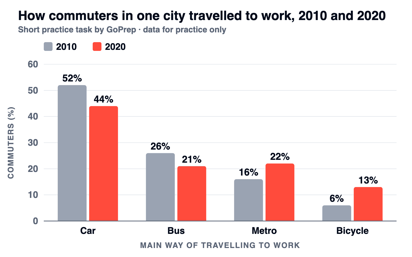
The chart above shows the main way commuters in one city travelled to work in 2010 and 2020. Summarise the information by selecting and reporting the main features, and make comparisons where relevant.
| Way of travelling | 2010 | 2020 | Change |
|---|---|---|---|
| Car | 52% | 44% | down 8 points |
| Bus | 26% | 21% | down 5 points |
| Metro | 16% | 22% | up 6 points |
| Bicycle | 6% | 13% | up 7 points, more than double |
Plan. Two groups: what fell (car, bus) and what rose (metro, bicycle). Then separate three features: the largest share and the biggest change in points (both the car) and the fastest growth (cycling, more than double).
Overview
Overall, the car remained by far the most common way to get to work in both years, although its share fell, while the metro and cycling gained ground, with cycling growing fastest.
Body paragraph 1
Cycling showed the sharpest relative change: the share of commuters who cycled to work more than doubled, from 6% in 2010 to 13% in 2020. The metro also grew, rising by 6 percentage points to 22%, which took it just above the bus (21%) by the end of the period.
Past years, so past simple and trend words. Your turn: write body paragraph 2 about the car and the bus. Give the car's fall in points and show how far it still leads.
FAQ
How do I write an overview for a bar chart?
Start with "Overall" and name the main differences: which bars are highest and lowest, and how the groups compare. If the chart shows change over time, add the biggest change. Keep the figures for the body paragraphs.
Which tense should I use for an IELTS bar chart?
Follow the task wording and the dates. No date and no other time clue: present simple. One past year: past simple. Several years: past simple for the changes, and forms like "is expected to" for projections.
Can I use words like increase or decrease in a bar chart?
Only if the chart shows change over time, such as two or more years. On a one-moment chart, compare instead: higher than, double, the lowest figure.
Do I have to mention every bar?
No. Select the key features: the highest and lowest bars, the biggest gaps and the groups that behave alike. Two middle bars a few points apart rarely need their own sentence.
How many words should a bar chart answer have?
At least 150. Around 160 to 190 words covers two groups of bars with figures and leaves time for Task 2, which counts twice as much.
How do I get band 7 or 8 on a bar chart?
For Task Achievement, band 7 asks for a clear overview, grouped data and the main differences identified; band 8 asks for key features that are skilfully selected and illustrated with figures. The Task 1 band is the average of four criteria, and your Writing score also includes Task 2, so one strong overview won't decide it.
What is the difference between a bar chart and a line graph in IELTS?
A line graph shows change over time. A bar chart can show change over time or compare categories at one moment, so check the dates first.
Where to practise next
The same moves carry over to a table, which holds the same kind of data in rows and columns, and a pie chart, which swaps height for shares of a whole.
A checklist can confirm that your report groups the bars and sizes the gaps. The next step is a plan. Tell the quiz your target score, your exam date and the part of IELTS you find hardest, and GoPrep will build a personal study plan around your answers.

GoPrep Team
GoPrep guide authors
We write about IELTS preparation using platform data and official exam materials.
All articles by GoPrep Team