A line graph shows how one or more values change over time: years or months along the bottom, a measured value up the side. For Academic Writing Task 1, aim to spend about 20 minutes and write at least 150 words to describe it, and Task 2 counts twice as much. So Task 1 has to be quick and reliable.
Before writing, look for the overall pattern. Which lines rise or fall? Do they cross? Those observations will help you decide what to include.
The good news: most of these gaps are easy to close. When students tried again, 35 of 42 reached 150 words and 18 of 21 added a comparison. The overview was harder: 14 of 25 added a summary sentence. That's why most of this guide is about the overview.
What the examiner checks
Your answer gets four scores of equal weight, and the Task 1 band is their average:
- Task Achievement: did you pick out the key features, give an overview and support it with figures?
- Coherence and Cohesion: is the report organised into clear paragraphs, with linking that helps the reader?
- Lexical Resource: range and accuracy of your vocabulary.
- Grammatical Range and Accuracy: varied, correct sentences.
The overview sits inside Task Achievement. The official band descriptors ask for "a clear overview" with main trends identified at band 7, while the band 6 descriptor says "a relevant overview" to be attempted.
The 4-paragraph structure
A reliable starting point is this four-paragraph structure. Adapt the grouping to the graph:
- Introduction. One sentence that paraphrases the task: what the graph measures and over what period.
- Overview. One or two sentences summarising the biggest trends and comparisons.
- Body paragraph 1. The first group of lines, with figures and dates.
- Body paragraph 2. The remaining features, with supporting figures and comparisons.
Group the lines that behave alike, for example two lines that rise, instead of walking through every point in order.
How to write the overview
You can start with Overall, and answer one question: if someone saw this graph for two seconds, what would they remember? Name the direction of each main line and how the lines relate to each other. Keep detailed figures for the body so the overview stays focused.
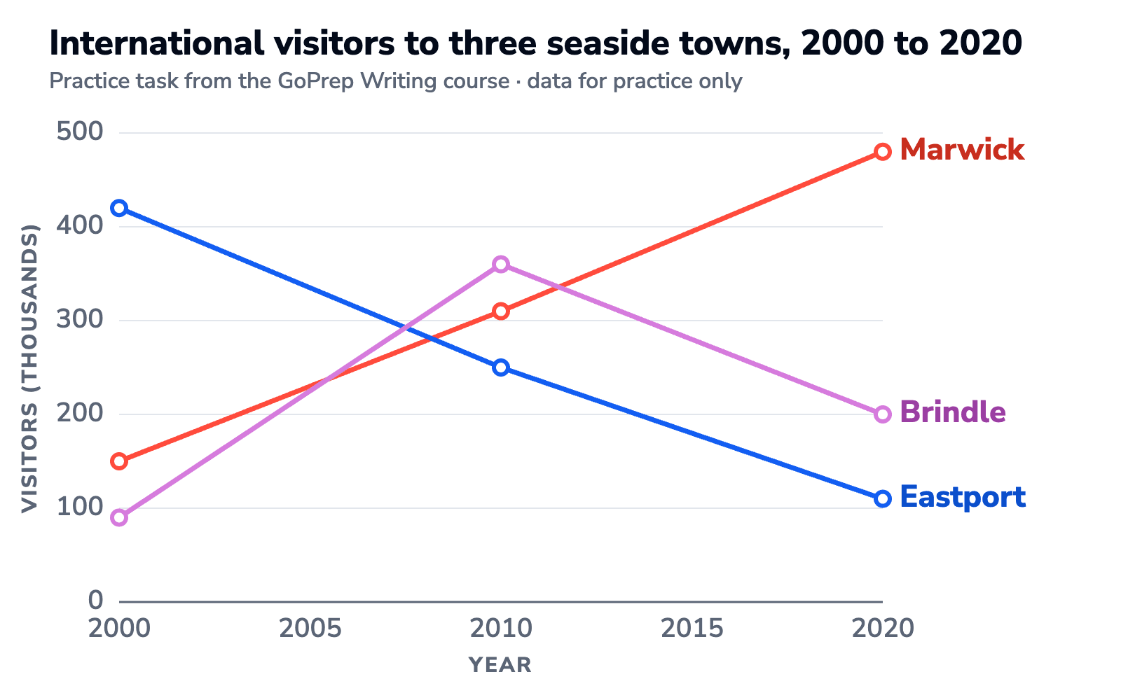
Use this practice graph throughout the guide. Marwick rises, Eastport falls, and Brindle peaks before declining.
Details without an overview
In 2000, Marwick received 150,000 visitors and Eastport received 420,000. By 2010, the figures were 310,000 and 250,000 respectively.
The figures are accurate, but this describes individual points rather than the overall pattern.
A clear overview
Overall, visitor numbers rose in Marwick and fell in Eastport, while Brindle saw an increase followed by a decline.
An overview that highlights the relationship
Overall, Marwick overtook Eastport to become the most visited town by the end of the period. Brindle peaked halfway through, then finished between the other two towns.
Both overviews identify the main features. The second also highlights the change in ranking. Neither paragraph alone determines a band score: the examiner assesses the complete response across all four criteria.
Vocabulary for trends
One useful sentence pattern combines a trend verb plus an adverb that says how big or fast the change was: rose steadily, fell sharply.
| Movement | Verbs | Nouns | Useful modifiers |
|---|---|---|---|
| Up | rise, increase, climb, grow | a rise, an increase, growth | sharply, steadily, slightly |
| Down | fall, decline, drop, decrease | a fall, a decline, a drop | dramatically, gradually, marginally |
| Highest point | peak at, reach a peak of | a peak | just over, around |
| No change | remain stable, level off | a plateau | roughly, about |
| Repeated rises and falls | fluctuate | fluctuations | wildly, slightly |
To show grammatical range, switch between the verb pattern and the noun pattern:
- Profits climbed steeply. becomes There was a steep climb in profits.
- Sales fell steadily. becomes Sales saw a steady fall.
When you switch, the adverb has to become an adjective: a sharply increase → a sharp increase. GoPrep suggests this word-form fix in 17% of line graph answers.
The three fixes GoPrep suggests most often in line graph answers:
- Subject-verb agreement, in 29% of answers: The number of visitors increase → The number of visitors increases. The verb agrees with number.
- Prepositions, in 27%: rose on 20% → rose by 20%. Use to for the new value (rose to 480,000) and by for the size of the change (rose by 330,000).
- Articles, in 22%: There was sharp rise → There was a sharp rise.
Three more habits finish the report:
- Use precise figures when given, and approximate when reading between gridlines: around 480,000, just over 110,000.
- Compare two lines in one sentence with whereas or while.
- Let the dates choose the tense: past years take the past simple, projections take is expected to or is predicted to.
Practice: a full line graph with a model answer
This task is from the GoPrep Writing course.
The graph above shows the number of international visitors to three seaside towns, Marwick, Eastport and Brindle, over a twenty-year period. Summarise the information by selecting and reporting the main features, and make comparisons where relevant.
| Town | 2000 | 2010 | 2020 |
|---|---|---|---|
| Marwick | 150,000 | 310,000 | 480,000 |
| Eastport | 420,000 | 250,000 | 110,000 |
| Brindle | 90,000 | 360,000 | 200,000 |
Model answer (159 words)
The graph illustrates how many international visitors travelled to three seaside towns, Marwick, Eastport and Brindle, between 2000 and 2020.
Overall, visitor numbers to Marwick rose steadily throughout the period, whereas Eastport saw a fall of almost the same size, so the two towns effectively traded places. Brindle followed a different path, climbing to a peak halfway through before falling back.
Marwick attracted roughly 150,000 visitors in 2000 and grew without interruption to around 480,000 by 2020, more than tripling over the twenty years. Eastport mirrored this almost exactly: starting as the busiest town with about 420,000 visitors, it declined steadily to about 110,000, a drop of nearly three quarters.
Brindle followed a different pattern. From a low base of about 90,000 in 2000, there was a sharp rise to a peak of roughly 360,000 in 2010, after which numbers slid to around 200,000 by 2020. By the end of the period it sat between the other two towns.
Why it works: the overview names all three shapes with no numbers, Marwick and Eastport are grouped as mirror images, and the body uses a noun pattern (there was a sharp rise), rounded figures and a comparison (whereas).
FAQ
How many words should a Task 1 line graph answer have?
At least 150. Around 160 to 190 words is comfortable: enough to cover the key features without wasting time you need for Task 2.
Do I need a conclusion in Task 1?
No. You need an overview. Most people put it right after the introduction, but it can also go at the end, as long as it's there.
Which tense should I use for a line graph?
Follow the dates on the graph: past simple for past years, forms like "is expected to" or "is predicted to" for future projections.
Should I explain why the lines go up or down?
No. Task 1 asks you to describe what the graph shows. Reasons and opinions aren't asked for and don't earn marks.
How long should I spend on Task 1?
Aim for about 20 minutes. The Writing test lasts 60 minutes in total, and Task 2 counts twice as much as Task 1. Leave roughly 40 minutes for the essay.
When can I use the word fluctuate?
Use it for repeated rises and falls. For a single rise followed by a fall, describe the peak and decline instead.
Where to practise next
A self-check tells you whether your report has the right parts. It can't tell you what band it would get. Start with the quiz: tell GoPrep your target score and exam date, and you'll get a personal study plan built around your goal and exam date.